Innovation festival
A festival raising the profile of innovation in West Yorkshire — bringing together innovative businesses, expertise, resources and support for new products, processes and services.
Year
2022
Scope
Branding
Client
West Yorkshire Combined Authority
Brief
Create an identity that complements the LEP brand while standing apart with its own style
Move away from a public-sector look to attract private investors
Build a toolkit for stakeholders
Challenges
Launching mid-pandemic, with the festival’s first stage entirely online, risking low engagement
No photography shoots possible due to health restrictions
Rationale
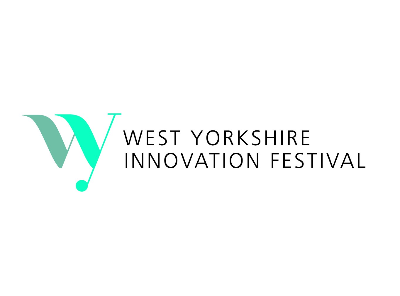
Innovation is often refinement rather than invention — a small change that improves something that already works. That idea, rooted in the people of West Yorkshire, is expressed in the logo’s isotype through an optical illusion where the “w” appears to pass behind the “y,” signalling depth of thinking. The vibrant colour of the isotype channels the energy of the discipline, while a simple sans-serif wordmark keeps the brand accessible — reinforcing that innovation doesn’t need to be complicated.